about
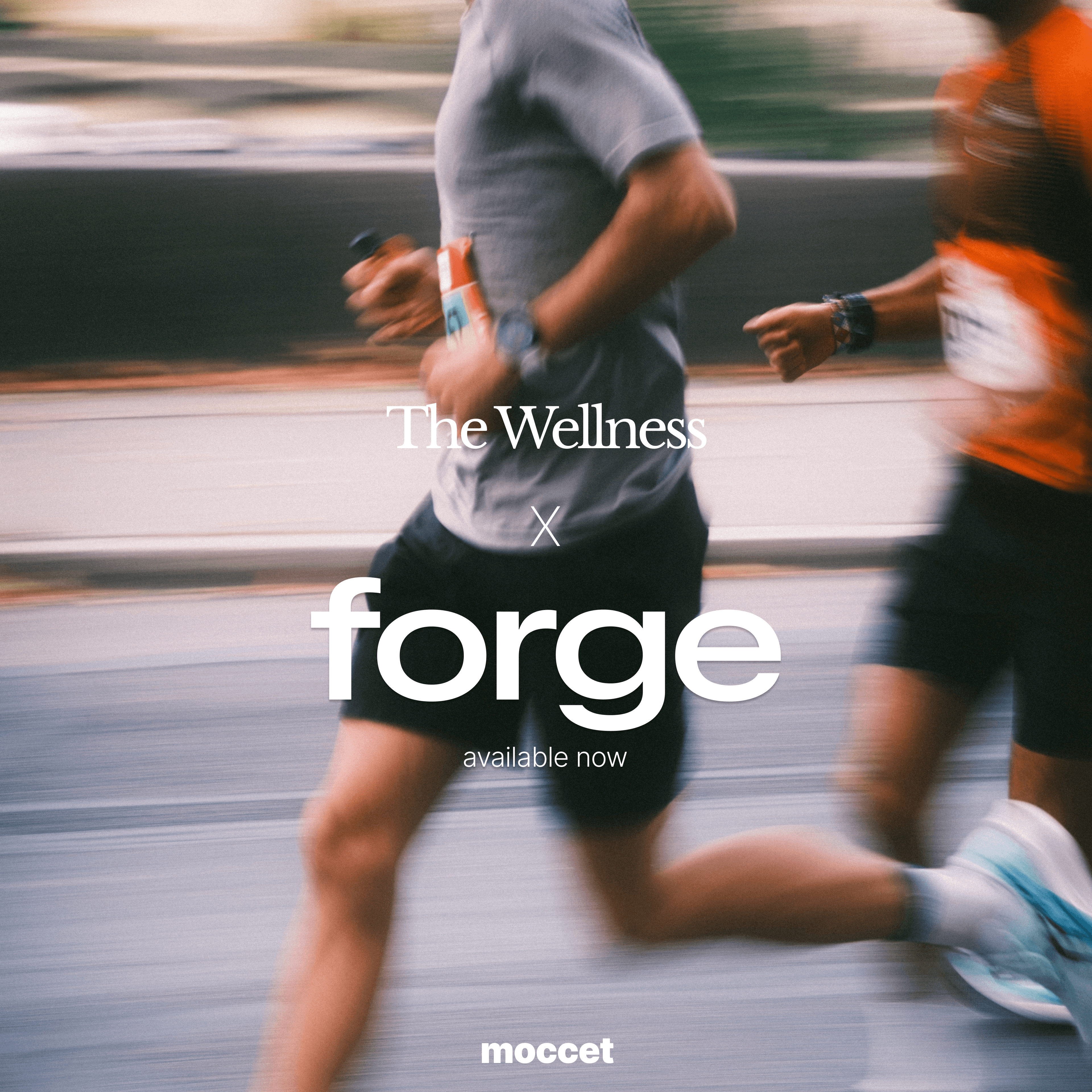
Forge is built on a straightforward premise: generic fitness programmes fail because bodies are not generic. The platform ingests biomarker data, recovery metrics, sleep patterns, stress levels, and daily schedules to construct exercise regimes that actually fit the person following them. When Studio Siraj was brought on to design the visual identity, the brief was clear. Forge needed to look as intelligent as its underlying technology without alienating the everyday athlete who simply wants to train smarter.
The platform sits at an interesting intersection. It runs on serious science and sophisticated data processing, but the output is practical. Real workouts. Concrete guidance. Adjustments that respond to how someone slept last night or how demanding their week looks. The brand needed to reflect both sides: technical credibility and accessible usefulness.
Studio Siraj developed a visual system grounded in structure and clarity. The identity uses clean geometry and a restrained colour palette that signals precision without feeling cold or overly clinical. Typography is functional and confident. Motion principles emphasise responsiveness, mirroring how the platform itself adapts to incoming data. Every design decision reinforces the core promise: this technology works for you, not the other way around.
The final identity positions Forge as a tool for people who take their training seriously but do not have time for guesswork. It looks capable because it is capable. Studio Siraj designed a brand that earns trust quickly and rewards it over time.
credits
Art Direction
Alex
Creative Direction, Strategy
Soraya


other works